Novel set in KENT, LONDON, PARIS
What can we learn from poor book cover design?
9th October 2016
I am no expert in the field of cover design. I have a bit of training in the arts, so I write this piece from a subjective viewpoint about what works for me and what doesn’t. To be honest, design and what makes a good cover has always fascinated me…
What tempts you to buy a book? Of course, the first thing a reader sees is the book cover. The jacket has a micro second – a blink of an eye – to seduce the potential buyer. Composition, alluding to content, has to brazenly catch that one glance and stand out from the crowd to warrant further investigation. It is a huge hurdle, and I cannot stress the importance of the right book jacket for an author’s writing. It has to be eye-catching! We have discussed the issue of good jacket design in our post “The case for recognising book cover designers. And some favourite book jackets of 2015” but now I would like to consider what might put people off buying.
An author has a vision, a publisher perhaps something entirely different. How much does the author have to acquiesce to the publisher, who after all has a wealth of experience? One might think that a cover that is a miss, is largely confined to the self published author, but interestingly author Jane Turley says:
There are quite a few authors who have moved into self-publishing because they feel their work is being wrongly marketed (principally through their covers) and want to have better control over how they are presented. I am self-published and maintain a tight control over the way I want my books presented and I am also learning some aspects of graphic design myself. I’ve even fired a “top” graphic designer because her designs were so awful! (Cost me £275 kill fee.) When I give talks about self-publishing the audience love this aspect – it really is far more complicated than everyone thinks and to see how you progress from the original concept to the final stages is very interesting. I look at covers now and can pretty much see how they’ve been put together – and a lot of mainstream genre novels are banged out as cheaply as possible with stock photos. If I were ever to become a trad novelist I would be very disappointed if I got one of those having now had the autonomy to do what I want.
Wise words indeed.
 Finding that you share a rather similar cover to another writer is disappointing. We just happened to spot these two stock covers, mirror images, but clearly the same – a different set of clothes and a varying shade of lipstick but essentially the same image.
The fact that two authors can buy the same intrinsic cover for their book does neither of them any favours. Can authors exert more pressure on the companies who supply stock covers so that duplication like this doesn’t happen? (Desperate in Dubai (set in Dubai) is by Ameera Al Hakawati and Wicked Wives (set around the world of the jet setter) is by Anna Lou Weatherly).
So what is it about the composition of a cover that will lure or repel? Thinking in terms of artwork, there are clearly images that attract and others that simply don’t make the grade. Much is to do with composition, clarity and colour – a good book cover is much like a good painting. Even if we don’t like the subject matter, we can still appreciate the intrinsic execution and design. One of the guiding – and safe – principles is to divide the cover into thirds – roughly the top 1/3 for the title, the middle for image, the lower for the author’s name. Talented jacket designers can of course get away with something more creative that doesn’t adhere to the structure.
I have taken a couple of covers at random and share some thoughts about why they don’t appeal to me personally. The cover in no way reflects the great content of some of these books… and yet, would I proverbially judge the books by their covers? Yes, I think I would, and I probably would bypass these books because of their covers.
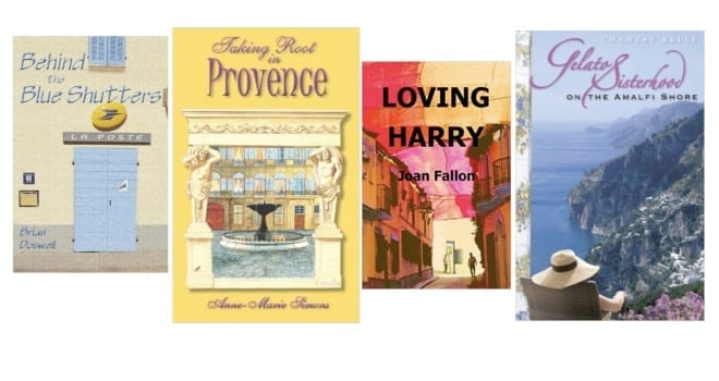
The jacket of Behind the Blue Shutters (set in Provence) definitely conveys the feel of France, to be sure. But there is so much going on, the cover feels so very cluttered. The title is crammed in between the doors and the shutters, the spacing is cramped. It just doesn’t have a harmonious feel, it feels essentially cobbled together. At the end of the word ‘Shutters’ is a ledge, it might have been helpful to erase that, as it adds nothing.
Taking Root in Provence (also set in Provence) is great for telling the reader that this book will take you to Provence. However there is too much curly writing to offer real clarity. If you look at any books on your TBR pile you will only rarely find both the title and the author’s name in the same curly script – it is usually only the title that allows for a bit of soft and flourishing lettering.
Loving Harry (set in Spain) has a lovely image for the cover, it has a really warm European feel. The lettering however is certainly too bold and in your face, too heavy and monochrome. The words makes the book feel two dimensional. And a couple of the letters of the author’s name get lost against the background, dark letters on a dark background is a no-no. A lighter tone and careful placement of the typography would perhaps have been a consideration.
Gelato Sisterhood on the Amalfi Shore (Amalfi Coast) has a lovely image, however the hint of an interior wallpaper on the left feels as though this book is stacked on top of another book, the floral pattern really detracts. As for the author, who is it, it’s difficult to determine…
 As someone who trawls through a lot of covers, day in, day out, I see a huge cross section of book jackets. Most work well enough, some are outstanding. Tigers in Red Weather by Liza Klaussmann for example, was an industry recognised ace cover design and on this link we talked to the people behind it. As you can see it is roughly divided into three parts and works really well. The colour is really eye catching and when it was first published spawned a fashion for books with a predominantly yellow theme.
Have you been put off by a book jacket? We would love to hear about your experiences of buying books in the Comments below, which ones have worked for you, which less so….???
Tina for the TripFiction Team
Do come and connect with Team TripFiction via Twitter (@tripfiction), Facebook (TripFiction), Instagram (TripFiction) and Pinterest (TripFiction)… and now YouTube
 Please wait...

What an interesting post. I agree that it is crucial to get a book’s cover right. If a reader doesn’t like the cover, it’s unlikely they will pick up the book unless they have read the author before.
I enjoyed this. Spent hours trawling through Amazon’s image bank for my own novel but eventually used a friend’s photo a) to ensure it was unique and b) for an authentic sense of place. Then we took the lettering colour from the photo and had professional help with the font, size etc. Not an easy job but came together well in the end and was responsible for a good proportion of the sales.
As a small press author, I know how difficult it is to find a great designer at reasonable prices. However, I also know (from past experience) how much impact a poorly designed cover can have. Very interesting article!