Novel set in KENT, LONDON, PARIS
Are we being seduced by the covers?
24th March 2016

Original Penguin design
We’ve come a long way since the traditional Penguin book design – and the cover is nowadays probably the most important single element in the marketing of a book. We are being seduced by the cover’s visual appeal when we are browsing in a book shop or online. We pick a book with a jacket that attracts us – and then read the synopsis, or the review extracts, to determine whether the book is for us.
The cover has to capture the essence of a book in a way that relates to its target readership. And it has to be culturally relevant… the UK and US editions of the same book, for example, often feature different covers to appeal in their respective markets. The crucial importance of the cover is very much recognised by book retailers. Whether they stock a new title, or give it a prominent display, is often driven by the jacket and their view of whether it will ‘sell’ the book effectively.
To explore the world of covers more fully, TripFiction interviewed four people intimately involved in their creation. Two were editors / publishers and two were designers. The two editors / publishers were Karen Sullivan of Orenda Books and Angus Cargill, a senior editor at Faber & Faber. The two designers were Mark Swan of kid-ethic (the independent design company that works with Orenda) and Alex Kirby (a senior in in-house designer at Faber & Faber).
First we asked questions of the publishers / editors:
TF: I was told by an author recently that ‘Book covers are essentially advertisements that need to serve as both consumer-facing and industry marketing; they’re the most expensive ad that a publisher will produce for many books.’ He said he did not wish to be involved in their design. Is this a general attitude, or does it very much vary by author?
Karen Sullivan:: In my experience, most authors want to be involved in the process and so they should. Ultimately, it’s their book and they need to be happy and proud to promote it. It is important to have a good designer who can balance input from the author (which normally goes through the editor/publisher), while creating something that is commercial and reflective of the contents of the book and the market it needs to hit. Most authors are aware that the book has to sell, and input from our sales team is critical. If they don’t think they can sell it in, no matter how much an author loves a jacket, it needs to be changed.
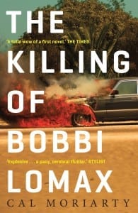
The Killing of Bobbi Lomax designed by Alex Kirby
Angus Cargill: A wise author there! That kind of understanding of the dual purpose of jacket design is not always understood by publishers, let alone authors. The other impulse is to want something beautiful and artistic above all. Of course, the three things aren’t mutually exclusive and the ideal for everyone is to get a jacket design that combines all three of these things.
I publish both literary fiction and crime and thrillers, and I think there’s often a clear distinction between the two, in terms of the author’s input and wishes. Literary fiction, particularly in Hardback, is often allowed to be more abstract, artistic or design led, and that can be appropriate. With crime and thrillers, both the publisher and the author (and agent) tend to be more commercially aware and ambitious.
TF: How important is it to create a cover that is culturally appropriate for the market in which a book will be appearing? I note that many UK, US, and Australian editions of the same book have differing covers.
Karen Sullivan: Jackets are very different around the world, and you only have to look across the Channel to see how very differently the French approach them. We distribute around the world so try to strike a balance, with jackets that will appeal to English readers in all territories. For this reason, I often run roughs past our international distributors.
We are also careful to get endorsements (jacket quotes) from authors who have some international appeal. There is nothing more depressing than getting a host of quotes from authors who appear on our own bestseller lists, only to be told that the Americans or the South Africans have never heard of them. When rights are sold, the acquiring publisher can do what they like. Interestingly, however, a great jacket will definitely travel and Ragnar Jonasson’s Snowblind was reprinted in Iceland, they chose to rejacket with our own cover.
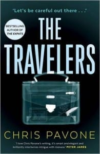
The Travelers – UK edition
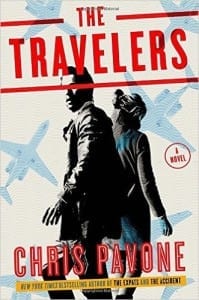
The Travelers – US edition
Angus Cargill: We publish in the UK and Australia, and there’s a fundamental difference in the markets. In Australia the original edition, usually a Trade paperback (same size as a UK Hardback) is their main, mass market edition. For that reason we sometimes do more mass market original covers specifically for them, essentially designs that have more of a UK pbk feel.
US cover design is really a whole different game – you rarely see the same design these days, when there are different UK/US publishers. The biggest difference seems to be in type size – US type design consistently looks so small and discrete to me, compared to here.
TF: How precise a brief do you give to the designer, and / or how much do you let creativity take over?
Karen Sullivan: I give the designer as much information as I can – what the story is about, key images or themes, the market we are aiming to hit, a bit about the author, if that is relevant. Then it’s over to the designer to see what he makes of my information tornado! Sometimes he chooses the tiniest little thing from my brief and expands it to something magnificent. I’m in awe of designers, frankly. Some of the things they dream up and put together are simply extraordinary. I definitely give free rein.
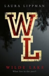
Wilde Lake designed by Alex Kirby
Angus Cargill: It varies greatly – sometimes I brief very specifically, or I should say very specific ideas are suggested; a specific place, object or moment from the book. Other times it’s just a general description of the tone of the book. We have such a great design team here though, who are thoughtful, responsive and collaborative, that it’s usually a very interesting process whatever way it begins.
TF: How long does the normal creative process take (if that isn’t a piece of string question…)? How may iterations are there usually before you are satisfied?
Karen Sullivan: It’s usually a week or so after briefing that we get in some roughs. In almost every single case there is one or two that stand out, and we might play with the colour or the typography on that one until it is absolutely perfect. Sometimes we do nothing at all! Once everyone has had some input, we can nail it down. It doesn’t take long. Usually a day or so once we’ve come to a decision. I can’t think of any time when we’ve had to go back to the drawing board completely.
Angus Cargill: Again it varies, but ideally within a month or so. As a rule of thumb, it’s the jackets that drag on for months that are always the hardest. You end up making too many compromises and losing the idea of what the jacket should say about the book.
TF: Do you test a design with market research or do you tend to proceed on judgment?
Karen Sullivan: We run it past agent, author, some key bloggers, my international sales teams, etc. IF we are torn, we sometimes ask for an opinion on Twitter or Facebook, or I might send it out to some booksellers or festival organisers (as I have done in the past). It does in many cases come down to instinct though. There is a ‘yes, this is it’ moment, and sometimes that moment strikes when I’m looking through the very first roughs! We include endorsements that will help to sell books, and definitely get some feedback on that!
Angus Cargill: Sometimes we do – with certain key retailers. For us, this certainly tends to happen more with the paperback editions in the UK, and sometimes with the originals in Ireland and Australia, for reasons previously mentioned.
TF: What, do you think, are the best covers you have seen?
Karen Sullivan: I think our covers are AMAZING, and this is largely down to Mark Swan and James Nunn (who designs David Ross’s and Kati Hiekkapelto’s jackets). We get very good comments from booksellers and other members of the trade, including sales reps, and most people confirm that Orenda books look and feel as strong as anything that comes out of the big houses. Outside Orenda, I loved jackets for The Miniaturist, The Girl in the Red Coat, The Strings of Murder and A Little Life. I like jackets that stand out from the crowd, with some original features or finishes. A jacket has to compel a reader standing in front of a sea of books to pick it up and turn it over. And then it’s the blurb that takes over.
Angus Cargill: Recently, I think our own designs for The Buried Giant, in both HBK and Pbk, were brilliant. I loved the adaptation from one to the other, and they just felt very classic and timeless. I thought they looked amazing in shops too.
Designed by Eleanor Crow at Faber & Faber
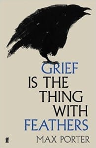
I really liked our cover and edition of Grief is the Thing With Feathers as well – a very beautiful design which was perfect for the book within (and, serendipitously perhaps, the cover was designed by someone here called Eleanor Crow).
Outside of Faber, I think the recent Stephen King covers – for Mr Mercedes, Finders Keepers and the forthcoming End of Watch were inspired, very clean but striking and clever. They made them very tactile too, as physical books, which can add a great extra level.
And I was really impressed with the Station Eleven cover which Picador came up with here, a world away from the US design, and perhaps a good example of the differences between our two markets. I loved that novel, and Picador’s design was so smart as it avoided trying to limit the book to one genre, it just made it look like something everyone should read. They then rolled that design idea/look out nicely for her earlier books too.
And now for the designers themselves – Mark Swan and Alex Kirby:
TF: How important do you think cover design is in the success of a book?
Mark Swan: I think that the success of of book is based on many different factors. Including an indescribable element that just makes a book a hit. A good cover is certainly important to the consumer when buying a book. The cover communicates so much to the reader and has to do so very short space of time. As with all things in life we are drawn to aesthetically pleasing things and those things are both universal and personal to the individual. You have to have the whole package with a book. A cover can be totally amazing but if the content is not there then it won’t sell. I’ve seen many books be huge hits that in my opinion have terrible covers. All this said. Yes. I think a good cover is very important to the success of a book because it takes a few people to pick up a book they have never heard of because they were drawn to a cover and then they love it and they tell their friend and so on and so on until it’s a hit. Also I have to say it’s massively important otherwise it makes me feel futile.
Alex Kirby: Very important. It’s likely to be the first thing a potential buyer sees, and has to convince them to pick it up and investigate further. On top of that, the design can form the basis for advertising and marketing campaigns. But to be brutally honest, a good jacket can only do so much – a successful book relies on a shrewd blend of production, sales, marketing, publicity and at the absolute heart of it … a cracking story.
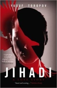
Jihadi designed by Mark Swan
TF: Is designing a book cover a very specialised skill – quite different from other graphic design projects?
Mark Swan: I’ve always working in the design field of turning lots of words into single images so I’ve not really delved into other areas of design but I would think that it is fairly specialised. I think that tone and a knowledge of genre is hugely important. I’ve had many people come to me with their portfolio’s and shown me cover designs that look amazing but totally miss the genre and core essence of the book. There is the danger of getting stuck in your ways though so I try to take inspiration from places other than book cover design as that’s where new ideas come from. A non book cover designer could be thrown into a cover project and come up with something really fresh because they are not bound by industry knowledge.
Alex Kirby: I would say so. You are, for most of the time, designing for a small rectangular format! You also need very strong typographic skills, and to be able design for a wide range of subjects and genres.
TF: How much do authors tend to get involved in briefing you / approving a design – or how much is it just the editor?
Mark Swan: It really depends on the book and the author. I’ve never been directly briefed by an author. Though I’m sure that their desires for a cover have made it into a brief. The editors are integral to the process so that would be the person that I would mainly get feedback from on how the cover is going. Some authors get final say over everyone. You then sometimes have to deal with the marketing department and then sometimes with the retailers. I’ve had some project that have gone through with everybody happy but then the retailer doesn’t like it and they won’t put it in prime spots in the shop so the cover gets killed. I do get authors getting involved with the cover. This can sometimes be very positive and sometimes not so much. I can see why they want input as they have slaved over their stories for a long time and something like a bad cover (or what they perceive to be) can really put a bad spin on their publishing experience.
Alex Kirby: For briefing, it can vary. Some authors provide strong ideas or references; others are happy for Faber to take the lead. For both scenarios, the Cover Team will convene, discuss the book at length and agree upon a brief. As for cover approval, all Faber authors are certainly consulted.
TF: How important is it for you to get under the skin of a book – understand its theme and likely audience – before you start on a cover design?
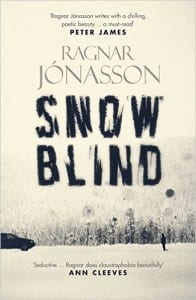
Snowblind designed by Mark Swan
Mark Swan: For me is very important to know lots about the book. I can then whittle down the information and imagery that I think is relevant and that which is not. Being a person who deals in imagery there is sometimes something with in a book that triggers a image in my head that no one else has considered. I do like to read as many books as I can for the covers I work on. Sometimes it’s not necessary as the publisher is quite specific on the type of cover they would like so brief me on information like the main characters of the setting of the book. Even an object that is key to the plot. It can be said that sometimes less is more when it comes to information, as getting bogged down with to much of the story can make for confusion in design. It all really depends on the story or the type of cover that’s needed. In all I like to know as much as I can as I feel that, on the whole, it can’t do any harm having to much information as possible to help in the creation of the cover.
Alex Kirby: Reading part or all of the book is preferable, but if this isn’t feasible I’ll discuss things with the Editor and see if a synopsis is available. Getting under the skin of a book – really feeling it is crucial. If the manuscript is in, I’ll work my way through it, noting anything that could help form a cover as I go. This could be colours, shapes, words, locations, phrases and so on. And this just the start of the creative process; next up is research, analysing the competition, trying various typefaces and so on.
TF: Do you prefer to work to a well thought through and precise brief – or might this hinder the highly creative element of what you do?
Mark Swan: It really does depend on the project. Sometimes it fantastic to be let loose on a design and also be trusted by a publisher to do so. That said it would be exhausting if that was always the case. It’s nice sometimes to be given all the information you need and then sit down and create that image. That can be just as enjoyable and challenging as letting go creatively. I would say that having free reign on a cover does tend to make me grow more as a designer and challenge myself in imagery and process.
Alex Kirby: I welcome a well thought through brief – one that provides concise information and solid starting points, yet allows you to go ‘off piste’ and find solutions that may never have been initially contemplated, particularly if the brief was too inflexible.
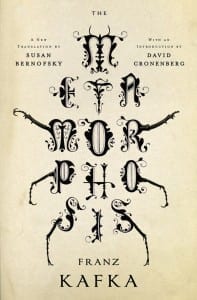
Metamorphosis designed by Jamie Keenan
TF: What, do you think, are the best covers you have seen?
Mark Swan: When I think of an answer to this my head hurts. There are so many amazing covers out there and the ones I love are always changing depending on where I am creatively at the time. Honestly I’ve just been staring at a wall for 10 mins thinking of an answer to that one but finding it really hard to pluck one out of the whirlpool of incredible cover flying around in my head. The cover for Metamorphosis by Jamie Keenan just whizzed by.
Alex Kirby: Great question… but almost impossible to answer! Can I instead list some designers and illustrators I particularly admire? There’s Suzanne Dean, (Creative Director at Penguin Random House) and Mark Swan, (Freelance designer). Neil Gower is a supremely talented Illustrator.
Readers should also check out some of the great entries at this years ABCD Awards, which are judged and voted for by publishing designers and illustrators.
A big thank you to all four – Karen Sullivan, Angus Cargill, Mark Swan, and Alex Kirby – for their very informative and comprehensive answers.
And to finish off, we link to a really interesting article by Claire Cameron on The Millions where she looks at the covers that work in the USA and UK
Tony for the TripFiction team
Come and connect with the team at TripFiction via Twitter (@tripfiction), Facebook (TripFiction), Instagram (TripFiction) and Pinterest (TripFiction)
 Please wait...

Thank you for posting this series of interviews. I’m interested in learning how other people view cover design.
Interesting that Bev Bookless (above) equates orange with the beach. I used it as the dominant color on the cover of my book, Descending Memphis, a detective/coming-of-age story that takes place in 1956, and primarily in that city.
The choice of orange stems from a guitar that appears in the plot. It’s a Gretsch Chet Atkins 6120, which most often came finished in orange. And of course, orange stands out on bookshelves and as a thumbnail image on the web.
Color selection forms just one part of what went into the cover art for Descending Memphis. My designer, Steve Donatelli, created an impressionist composition using three images: a deconstructed shape of the guitar already mentioned, a hand holding a pistol, and a women’s pair of legs wearing high heels rising from the cover’s bottom.
The choice of imagery came from my discussions with Donatelli. We spoke about objects important to the telling of the story and that transmit emotion. We also spoke about type design for the title and the other text elements on the cover. Another point we discussed, and which Donatelli achieved, was to capture aspects of pulp detective style without making the design feel dated.
You can see the cover at http://bit.ly/1TY8qa1
– Robert R. Moss, author of Descending Memphis
A great article. To me the book cover is very important, particularly for authors that I am not familiar with. Colour as well as design that reflects the story are equally important. Bright pink or orange maybe ok for the beach and in my perception may hold holiday read material but on the train I am not so sure. But there again it’s all down to individual taste.