Talking Location With … Stephanie Dray / Laura Kamoie: WASHINGTON DC
Musings on book covers
18th August 2022
Musings on book covers.
I get it. With around 188,000 books published per annum in the UK, 1.7 million per annum globally, there is a fair chance that covers will feel similar, some will provide inspiration for subsequent books down the line; others are downright copies. Some books will catch the reader’s eye and encourage a read, others will be a total turn off. Different markets require different images to get their reading market salivating.
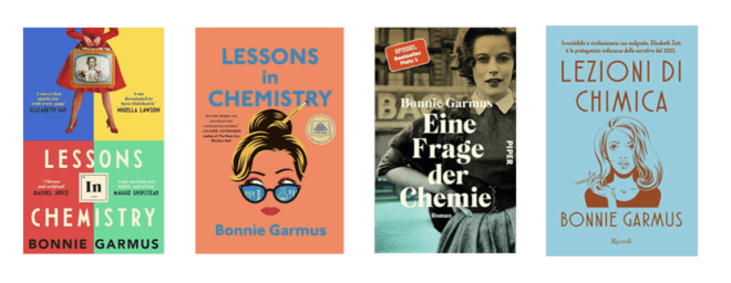
Social Media is a wonderful place to initiate a chat. And one of the original conversations was about the different covers that top selling Lessons In Chemistry by Bonnie Garmus, set in California, has (and now being made into a film). I look at the covers below – UK – USA – GERMANY – ITALY respectively, and cannot begin to wonder quite how different these covers all are. I am immersed in the UK market and therefore I am a prime target for loving the UK book cover. I struggle to understand the appeal of other three covers. In comparison they seem weak and unassuming. I love that the UK cover has a striking woman and a nod to the periodic table and has vibrant colours, it is well designed (kudos to the designer) and it stands out from the crowd. The USA and Italian version disappear into the background – could you ever imagine picking up the dull and unprepossessing novels? Yet, presumably the research has been done in the other countries and they will appeal to their target audience, one hopes. The German cover would appeal to the German market (I know a little about it) but to me with it looks too dull, worthy and academic – which it is so isn’t.
Another trend recently – and I had a wonderful discussion with Locky Loves Books (give her a follow on Twitter @Locky_football – there is always interesting chat to be had!) about books that seem to have taken quite a liberty, by taking inspiration from other author’s book covers. Inspiration? Maybe even downright copying!
Author Katie Khan published her novel in 2017, titled Hold Back The Stars. She was taken aback to discover the book cover design of The Origins of Iris by Beth Lewis, and which seemed a little too close for comfort. We will leave you to decide.

Photo: Katie Khan
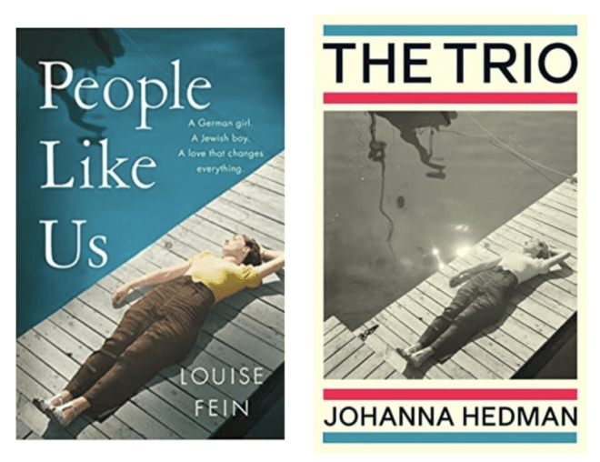
The whole book cover discussion started off recently, when I shared that two novels, published by bigger publishing companies, which had reworked the same stock photo. It got me wondering whether it matters that two covers essentially use the same image. One thing is for sure, they got a great deal of exposure when the titles were placed together. As a positive, I imagine that if you have liked one novel with a specific stock image, and you espy its use once again, then the familiarity will draw your eye to it. As a negative, it seems to suggest creative input was limited.
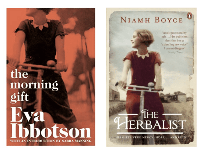
When the above images were posted to Facebook, they garnered quite some discussion and Christina Pitt posed the question: whether there was a database where publishers/authors could check which stock images might already be adorning a book cover? Paula Doyle kindly highlighted the same image used by The Morning Gift by Eva Abbotson and The Herbalist by Niamh Boyce – the image lends a historical vibe to both covers. If I was an author, I think I would very much mind if this happened to my book.
Further discussion ensued and the similarity of some book covers arose. In this instance there is a shorthand that tells the reader the kind of novel that is on the shelf, but my personal feeling is that I would get them mixed up in my mind, especially when time had elapsed after reading them. Would you remember these after you had read them? One thing the titles below have in common is that they are from the bigger publishing houses.

Which in turn got me thinking. If many of these ‘similar’ book covers are coming from the bigger publishing houses, they 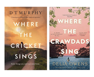 are on a roll, getting the books in front of their audience; but is enough time given to developing a unique book cover to really make an eye catching impact? Perhaps they are being sourced from a pool of book covers, where the individual elements and colours are changed and then brought to market.
And what about conscious copying? That is a burgeoning sector. If one author/publisher has success with a specific cover, then there is certainly the temptation to rip off. Perhaps hoping that readers will confuse the two and in that way sales of the copycat version might increase; or the fame and fortune of the original will rub off? Who knows but I guess we can say is “we see you”…
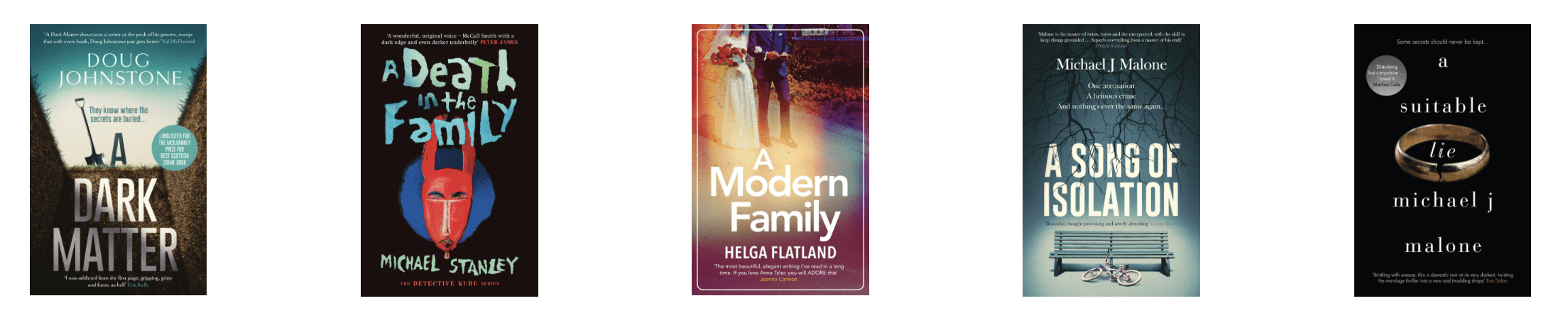
Consider some of the smaller indie publishers, like Orenda Books, who create individual covers for each of the books they publish. They give their authors a unique voice by providing stand-out covers. They have clearly taken time to create something unique to each of the authors, which you can see in this line up of randomly selected covers.
So, I guess I am left wondering whether larger publishers feel that they can get away with generally producing covers for the mid-list books that ‘do the job’ but do little more. And if a novel comes along that is likely to hit the big time, then a lot more time (and money) is spent on producing a uniquely wonderful and eye-catching cover, as per Bonnie Garmus’ novel Lessons in Chemistry (and I am talking about the UK edition only 😉).
We would love to hear your thoughts and observations on cover design.
Tina for the TripFiction Team
Join team TripFiction on Social Media:
Twitter (@TripFiction), Facebook (@TripFiction.Literarywanderlust), YouTube (TripFiction #Literarywanderlust), Instagram (@TripFiction) and Pinterest (@TripFiction)
 Please wait...

And even when stock photos aren’t used, there is such a thing as too many following the same trend (the women with their back facing the reader, running away into a landscape, for example). It is so hard to get the cover right. We are still learning and trying to improve at Corylus Books, but we are certainly making the effort to treat each book/author individually.
1 Comment
That is so heartening… red women running away in a snowy landscape. It is such a subjective issue, book cover design, but when it is right, it really is right! Thanks for stopping by!
What an interesting piece. I think creative input can sometimes go too far though. My youngest daughter, who’s an editor at a big publishing house, once sat in a meeting where 60 variants of a cover were considered! Interesting to see how stock photos were used in a couple of your examples. I agree I wouldn’t be very happy if they were my books. I certainly think publishers latch onto a certain look that they see as a good seller. A current example is all the covers inspired by the Thursday Murder Club ones.
1 Comment
Thank you so much… I find the subject of book covers fascinating. Agree about the Thursday Murder covers, everywhere now shouting “look at me”